Central Bank's Website Branding Transformation

Balancing Tradition and Innovation
Project Overview
Central Bank, the pinnacle of financial seriousness, decided it was time to drag its website out of the dark ages. Luckily they had me to do it (and lots of teamwork). Let’s see if I can turn a 2005 brochure-lookin’ site into something that won’t lose all our customers to the latest fintech.
The Goal
Transform Central Bank's homepage and breathe new life into their overall website branding. We aimed to modernize their digital experience while maintaining trust and reliability. Think modern but not cutting edge. Keep both millennials and octogenarian account holders happy.
My Role
UI Designer, Researcher, and Brand Strategist
Time Frame
6 months of turning "We've always done it this way" into "Why didn't we do this sooner?"
My Team
  • Me: helping to lead the charge on UI, research, and brand strategy
  • 1 Web Designer & Strategist (my partner in guiding accessibility and long-term success)
  • 2 Mobile App Gurus (helping unite the app and website branding)
The Project Backstory

brand chaos

My team and I inherited a digital Frankenstein's monster. And don’t think I’m being dramatic. It’s true. Brand standards? Non-existent. Graphics? Looks like 12 different sites. Headings without hierarchy, copy without a personality, and the maze that was our information architecture. There were countless pages I couldn't easily find, not to mention our users.

Kickoff: External Flop to Internal Opportunity

To kickoff the project, leadership hired an external design firm to help us out. Unfortunately, it didn't work out quite so well with the external team's designs, so the majority of the project got put back into my (and my team's) hands. Luckily, I call that an opportunity to show leadership how I can deliver better results.

Here you can see the evolution of the Central Bank homepage from 2016 on the left to 2017, 2019, and finally 2022.
Goals & Challenges (Wait, We Need How Many Approvals?)

goals

  • Brand Refresh: Breathe new life into those tired colors, imagery, and overall look.
  • IA Overhaul: Make finding information less like navigating a maze.
  • Design Efficiency: Develop a Figma-based system with reusable components.
  • CMS Efficiency: Revolutionize processes and make content updates easier.

challenges

  • Stakeholder Stubbornness: Convincing stakeholders to change their minds about old ways of thinking was very challenging (an understatment).
  • Creating Cohesion: The app and website weren't speaking the same language.
  • Ease of Development: Designing for better front-end efficiency and smoother handoffs.
Research & Discovery
Unearthing the Good, the Bad, and the "Is This Too Much Green?"

Detective Work

  • I dove into rival banks' digital presence with forensic investigator levels of intensity. (Look, it’s boring to just say competitor analysis).
  • Color theory and branding became a new obsession. I think I hate the color green now. (I'm thinking orange would be a great color to work with).

Target Audience

  • Ages 25-55, Midwestern, appreciates local banks with excellent customer service.
  • Seeking a financial institution that balances tech with personalized service – thinks, a bank that's tech-savvy but still remembers their name (and maybe their dog's).
Research & Discovery: Continued

throwing wrenches

When stakeholders put the brakes on testing, I got creative. Instead of throwing in the towel, I turned to competitor analysis and dusted off old research data. It wasn't ideal, but when are things ever ideal?

Key Findings

  • Our website was speaking a different language than our users (banking jargon, anyone?).
  • Our benefits showcase was not even benefits. Honestly, I don't even know how we had any conversions.
  • We needed designs that were friendly, spoke human language, and clearly communicated benefits.
Design Process: From Chaos to Coherence
Phase 1: Setting the Stage for a Bold New Look

Mood Boards & Inspiration

I developed three concepts aiming to balance fresh appeal with traditional, classier elements.

Mood Boards

Concept 1 emphasizes quality photography, large images, and serif fonts for headings. An emphasis on typography, white space and lines, and custom illustrations gives a high-end look.

Concept 2 conveys a clean and tech-savvy feel. I noted to be careful to avoid feeling sterile and cold. More of an opportunity to add subtle contrasts.

Concept 3 is the starting point for the brand redesign. I wanted to emphasize modernity, friendliness, and uniqueness with this one. It would also help cater toward a younger demographic.

Early Design Decisions

  • Color Palette Simplification: I simplified our palette and snuck our primary color into the text for subliminal brand reinforcement.
  • Typography Revolution: I introduced serif fonts for headings to add contrast, improve hierarchy, and inject some elegance.
  • The Green Challenge: After experimenting with a million variations of green, blue, purple, and yellow, we finally struck gold (or rather, green) with a web-friendly variation that kept leadership happy.

Brand Evolution Through Design Elements

  • I had the idea to creatively incorporate the "pistols" of the flower logo as a motif throughout the site.
  • I also introduced circular themes and rounded elements for a friendlier feel.
Design Process: From Chaos to Coherence
Phase 2: Refining the User Journey

testing the Information architecture

I finally got to put my designs in front of real people. The final IA, as you will see below, is based on the card sort and tree test that I ran. Those tests allowed me to create logical groupings where non-bankers would naturally look for stuff.

Navigation Overhaul

  • To avoid a major pain point from the old navigation, I switched from frustrating hover-based navigation to a more forgiving click-based menu.
  • I introduced a large, open mega menu design to showcase the bank's offerings.
  • I created stronger visual connections between main and sub-navigation elements.

Old Navigation

The old navigation was difficult to use: Users had to hover to open the sub-nav, causing errors when not precise enough with the mouse.

Navigation iterations

Early navigation designs show a disconnect between the top and bottom sections, and a lack of bold color. I needed to tie the Personal and Business top tab section with the bottom navigation. I also needed to portray strength and stability by adding more color.

Expanded menu

The earliest version showed a small dropdown menu, which lacked robustness and made the bank seem smaller. I wanted to add the mega menu to give the bank a stronger presence and show more of its offerings.

Final navigation

Final navigation expanded

Mobile Navigation

I simplified the desktop experience for mobile, focusing on:

  • A cleaner interface with larger touch targets, to reduce the chance of user error.
  • Finding a balance between clean design and number of clicks for the user.

Mobile navigation iterations

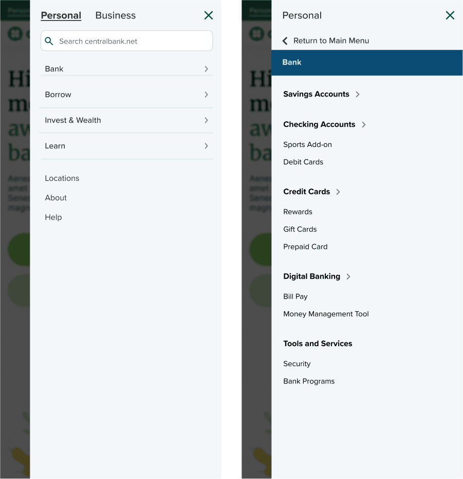
Examples of mobile navigation initial design concepts.

Final mobile navigation

Accessibility Revamp

No more afterthought for accessibility! I put accessibility controls front and center with high contrast for visibility and added hidden close buttons for keyboard users.

Accessibility

Ease of accessibility in the navigation.

Footer Design: Less is More

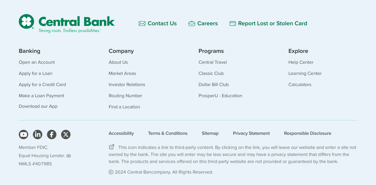
I used analytics data to make the decision to merge three separate footer sections into one logical, streamlined unit that prioritized frequently used links.

Design Process: From Chaos to Coherence
Phase 3: Elevating the Homepages

personal page

I focused on making users feel supported at every stage of their financial journey. I used friendly, human-centered imagery and simplified service categories to guide users toward solutions that fit their everyday needs. This design emphasizes clarity, empathy, and action.

business page

My goal with this page was to position the bank as a true partner for business owners. I created a streamlined structure that highlights tailored financial tools and services, while integrating helpful features like the analyzer quiz to support smarter decision-making.

invest & wealth page

I designed this page to make wealth management feel approachable and clear. I segmented services based on user needs, like how much they have to invest, to guide customers down the right path.

modular design

We built a collection of new modular and responsive blocks to re-use across the site. The three homepages serve as the cornerstone of the new design; the blocks allowing for efficient page building and a cohesive experience.

Results & Lessons Learned

Key Takeaways

  • When ideal research methods aren't possible, get creative with alternatives.
  • Present data-driven arguments but be prepared to compromise.
  • Sometimes you have to accept that you can't win every battle.

By the end of the project, we had transformed Central Bank's digital presence from a confusing labyrinth into an intuitive, cohesive experience that balanced tradition with innovation.

Back to Top