
Transforming Central Bank's outdated website branding
Wanna see an amazing rebrand? This is the page to look at. I modernized the digital experience while maintaining the trust, reliability, and local feel that Central Bank is known for.
.png)
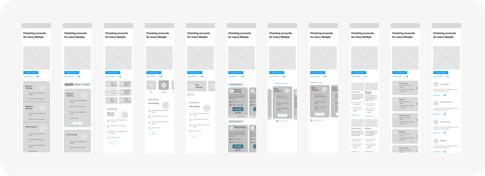
Forms reform
I redesigned our lead generation forms to reduce friction and improve targeting — resulting in higher-quality submissions, fewer junk leads, and better conversions.
.svg)

%20(1).png)


.png)
.png)
.png)


%20(1).png)
%20(1).png)
.png)

%20(1).png)

