Transforming Lead Generation Through Strategic UX Design
Project Overview
Our forms were one of the most critical steps in the user journey—and also one of the weakest links. Friction-heavy layouts, inconsistent UI, and unclear messaging were quietly undercutting our lead generation efforts. I set out to rethink the entire experience, aligning form design with user behavior, modern patterns, and business goals.
My Role
Lead Designer & UX Researcher
What's Wrong with the Forms? Everything.
They required excessive text inputs, leading to submissions with sensitive data and off-topic inquiries. (I saw an SSN one time 💀).
Unclear purposes: was it a service form? A lead gen form? A cry for help?
Absolutely no tracking, so we had no way of finding drop-off points.
No visual or structural consistency from one form to the next; ignoring best practices.
Objectives
Actually generate leads. Good ones.
Improve conversion through an experience that doesn’t feel like we hate our users.
Eliminate service inquiries by directing non-lead traffic appropriately.
Implement tracking so we know what's working.
Eliminate redundancies on the backend and make form creation super efficient.
Old Forms
A little taste of some of the problematic forms on the site.
My Approach
1. The Research (a.k.a. The Lingerie Part…Just stay with me, it’s not weird, I promise.)
forms audit
I started with a heuristic evaluation of every form on the site — 30+ in total. If you're a designer, you'll understand that "hellscape" was the correct term for these forms.
To paraphrase my audit: “Field lengths don’t match input expectations. Some titles are missing. Some are vague. Button styles vary. Spacing is off. Same questions, different labels. Forms are too long and too unclear. We’re not guiding users — we’re hoping for the best.
I Visited a Lingerie Site for This Project. For Science. on my work computer.
I did a competitor analysis — banking, fintech, and ecommerce. Yes, my browser history now includes multiple visits to a certain lingerie brand. Strictly professional. Their form flow? Obviously, great. Delightful microcopy and zero confusion.
After the audit, I put together a presentation on forms best practices and pitched it to the Director of Digital Marketing. Then, with help from my PM, we built a roadmap covering strategy, backend requirements, and realistic timelines.
My Approach
2. Form Design & User Experience: Elemental Overhaul
form components
Before touching layouts, I rebuilt our entire set of form components. They now have:
Input fields that fit the data type (ZIP code fields needn't be a million pixels wide).
Mobile-first, precision touch targets. A guaranteed frustration-free experience.
Helpful validation and microcopy that's more human and less robotic.
ADA-compliant colors and correct aria-label implementation.
form layout
Once the foundation was solid, I tackled the layout by:
Creating a single-column design to simplify flow.
Reducing free-text inputs to stop users from writing everything someone would need to steal their identity (Designers are true heroes).
Implementing progressive disclosure, so users only see what is relevant at the moment.
Using conditional logic to tailor experiences without overwhelming the user.
My Aproach
3. Lead Qualification: Smarter Questions, Better Data
form strategy
We didn’t just want more submissions—we wanted the right ones. Here's what I did:
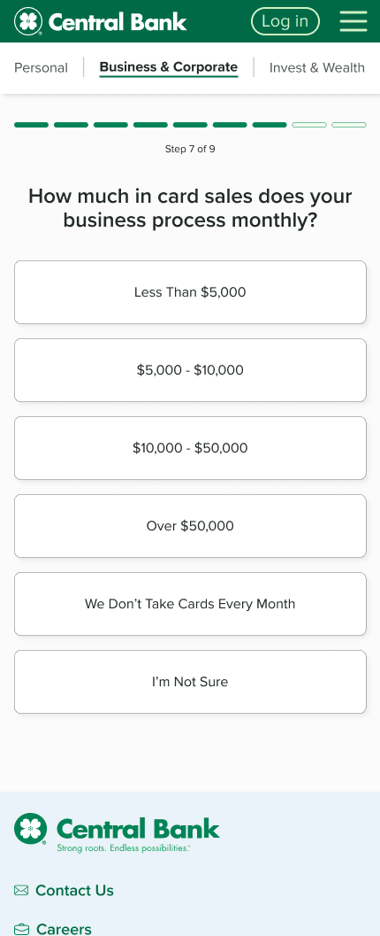
Introduced multi-step forms for better lead qualification. The idea is to collect more relevant information, filter out low-intent users, and focus on high-value prospects.
Focused on rewriting form content to focus on intent and specificity.
Set expectations (like “We’ll respond within 1 business day”) so users felt heard.
Introduced more relevant questions to pre-qualify leads.
highlights
I broke down the form into logical, digestible steps.
I added progress indicators (users love to know if there's an end at some point).
I used questions that gently guide users toward qualifying themselves. (I worked specifically with the head of merchant services to get the questions exactly how they needed).
Multi-Step Form: Merchant Services
Outdated Mess to Lead-Gen Factory
User flow diagram
I made a user flow diagram to map the route of the form questions. There is a lot of conditional logic and a few different paths the user could take in this form. A flow diagram is a great way to conceptualize these paths.
Wireframing
After getting feedback on the form flow, I moved on to creating wireframes. Next I created the high-fidelity mockups.
Testing Strategy: Evidence, Not Assumptions
Testing is next on deck, and here's the plan:
Moderated Usability Testing: I’m preparing sessions to validate the multi-step form.
A/B Testing: We’ll experiment with question count and flow to find the sweet spot. If users feel fatigued with the form length, I will cut some questions.
Key Metrics: Completion rate and drop-off points.
What Didn’t Make It: Calendar Scheduling
One idea I was excited about? A form that let users schedule meetings with business bankers based on location. The concept filtered nearby branches, pulled in real-time availability, and displayed it beautifully.
It would require a complete overhaul of our calendar systems and someone to maintain it regularly. It was rejected for the complexity we couldn't achieve with current resources. RIP, calendar form. I thought I'd show a few of the screens:
Wrapping it Up
What this project ultimately will acheive
Higher completion rates
An increase in qualified leads
Faster development time for forms
Standardization across the site
reflections
Looking outside my industry was essential here. You ain't gunna find much better forms (especially multi-step) outside of ecommerce.
I really stepped up my game with presenting to stakeholders on this one. I learned a better approach to fully flesh out the project scope and present a compelling case.
.svg)
.png)
.png)
.png)
.png)
.jpg)
.jpg)
.jpg)
.png)


%20(1).png)
.png)


.png)
.png)
.png)
.png)


.png)


